Chapter 7 Bivariate Graphing

“The greatest value of a picture is when it forces us to notice what we never expected to see.” — John Tukey
7.1 Overview
So far, we have examined data obtained from one variable at a time (either categorical or quantitative) and learned how to describe the features and distribution of the variable using the appropriate visual displays and numerical measures. Now we will consider two variables simultaneously and explore the relationship between them using, as before, visual displays and numerical summaries. When graphing your variables, it is important that each graph provides clear and accurate summaries of the data that do not mislead.
7.2 Lesson
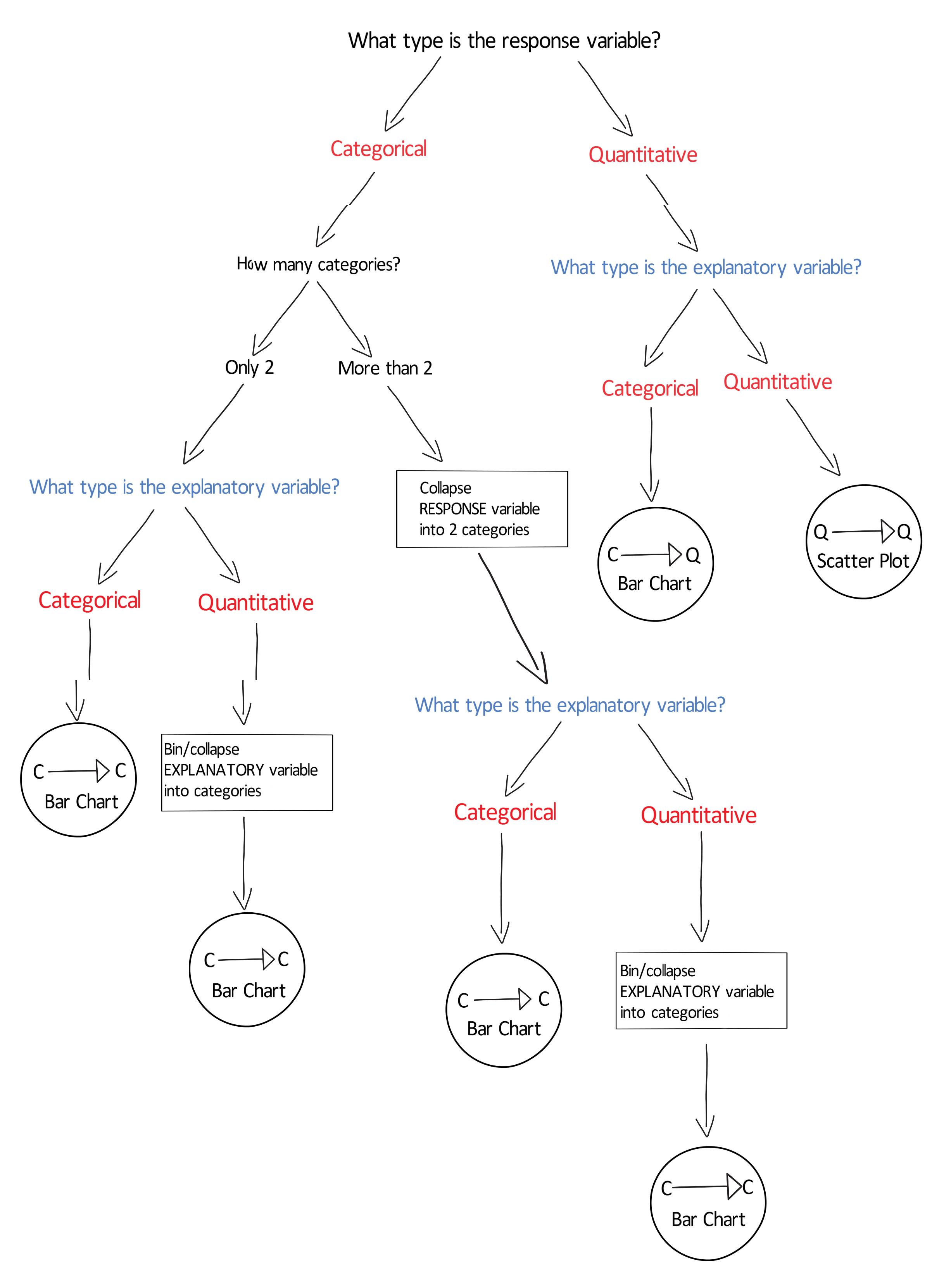
Understand why we impose a causal model on our research question despite the fact that causation cannot be directly evaluated based on observational data. Assign roles to each of your variables. Which will play the role of explanatory variable and which will play the role of response variable? Learn to use the graphing decision flow chart to determine, based on variable types, the appropriate graph for visualizing each relationship. Consider what types of bivariate graphs will help you graphically visualize your research question. Understand how to interpret bivariate graphs. Note that in some cases, the bivariate association may differ for population subgroups. Graphing the subgroups by adding a third variable will help to visually determine if population subgroup differences may exist. Click on a video lesson below.
SAS – R – Python – Stata – SPSS
Graphing Flow Chart:
7.3 Syntax
7.3.1 bivariate graph (categorical explanatory, categorical response)
SAS
proc sgplot;
    vbar CategExplanatoryVar / response=CategResponseVar stat=mean;
    title “Title Here”;
R
ggplot(data=myData)+
stat_summary(aes(x=CategExplanatoryVar, y=CategResponseVar),
fun.y=mean, geom=”bar”)+
ggtitle(“Descriptive Title Here”)
Python
seaborn.factorplot(x="CategExplanatoryVar",
y="QuantResponseVar", data=myData, kind="bar", ci=None)
plt.xlabel('Label for CategExplanatoryVar')
plt.ylabel('Label for QuantResponseVar')
plt.title('Descriptive Title Here')
STATA
graph bar (mean) CategResponseVar, over(CategExplanatoryVar)SPSS
Use graphical user interface (GUI)
7.3.2 bivariate graph (categorical explanatory, quantitative response)
SAS
proc sgplot;
    vbar CategExplanatoryVar / response=QuantResponseVar stat=mean;
    title “Title Here”;
R
##Below is code for bar graph
ggplot(data=myData)+
stat_summary(aes(x=CategExplanatoryVar,
y=QuantResponseVar), fun.y=mean, geom=”bar”)
Below is code for boxplots
ggplot(data=myData)+
geom_boxplot(aes(x=CategExplanatoryVar,
y=QuantResponseVar))+ ggtitle(“Descriptive Title Here”)

##Below is code for density plots
ggplot(data=myData)+
geom_density(aes(x=QuantResponseVar,
color=CategExplanatoryVar))+ggtitle(“Descriptive Title Here”)
Python
scat1 = seaborn.factorplot(x=CategExplanatoryVar,
y=QuantResponseVar, data=myData, kind="bar", ci=None)
print(scat1)
STATA
graph box QuantResponseVar, over(CategExplanatoryVar)SPSS
Use graphical user interface (GUI)
7.3.3 bivariate graph (quantitative explanatory, quantitative response)
SAS
proc sgplot;
    scatter x=QuantExplanatoryVar y=QuantResponseVar;
    title “Title Here”;
R
ggplot(data=myData)+
geom_point(aes(x=QuantExplanatoryVar, y=QuantResponseVar))+
geom_smooth(aes(x=QuantExplanatoryVar, y=QuantResponseVar),
method=”lm”)

## Note, adding 3rd variable by using the color argument
ggplot(data=myData)+
geom_point(aes(x=QuantExplanatoryVar, y=QuantResponseVar,
color=CategThirdVar))+
geom_smooth(aes(x=QuantExplanatoryVar, y=QuantResponseVar,color=CategThirdVar), method=”lm”)
Python
seaborn.regplot(x="QuantExplanatoryVar",
y="QuantResponseVar",
fit_reg=False, data=myData)
plt.xlabel('Label for QuantExplanatoryVar')
plt.ylabel('Label for QuantResponseVar')
plt.title('Descriptive Title Here')
STATA
twoway (scatter QuantResponseVar QuantExplanatoryVar) ///
(lfit QuantResponseVar QuantExplanatoryVar) // adds reg line
SPSS Use graphical user interface (GUI)
7.3.4 3rd variable graph (categorical explanatory, categorical response, categorical 3rd variable)
SAS
proc sgplot;
    vbar ExplVar /response=RespVar group=ThirdVar groupdisplay=cluster stat=mean;
    title “Title Here”;
R
tab1 <- ftable(myData$CategResponseVar,
myData$CategExplanatoryVar,
myData$CategThirdVar)
tab1
tab1_colProp <- prop.table(tab1, 2)
tab1_colProp
Python
seaborn.factorplot(x="CategExplanatoryVar",
y="CategResponseVar", hue="CategThirdVar", data=myData,
kind="bar", ci=None)
plt.xlabel('Label for CategExplanatoryVar')
plt.ylabel('Label for CategResponseVar')
plt.title('Descriptive Title Here')
STATA
ssc install catplot
catplot CategResponseVar CategExplanatoryVar, percent(CategExplanatoryVar over (CategThirdVar)
SPSS Use graphical user interface (GUI)
7.3.5 3rd variable graph (categorical explanatory, quantitative response, categorical 3rd variable)
SAS
proc sgplot;
    vbar ExplVar /response=RespVar group=ThirdVar groupdisplay=cluster stat=mean;
    title “Title Here”;
R
ftable(by(myData$QuantResponseVar,
list(myData$CategExplanatoryVar, myData$CategThirdVar),
mean, na.rm = TRUE))
Python
seaborn.barplot(x="CategExplanatoryVar", y="QuantResponseVar",
hue="CategThirdVar", data=myData, ci=None)
plt.xlabel('Label for CategExplanatoryVar')
plt.ylabel('Label for QuantResponseVar')
plt.title('Descriptive Title Here')
STATA
graph bar (mean) QuantResponseVar, over(CategExplanatoryVar) over(CatThirdVar) ///
blabel(bar) // displays mean value for each bar
SPSS Use graphical user interface (GUI)
7.4 Assignment
Submit a graph showing the association between your explanatory variable and your response variable. Describe what the graph shows. Include an additional graph(s) of your bivariate relationship by a third variable. Describe any similarities or differences in the association between your explanatory and response variable for different levels of your third variable (i.e. different population subgroups).